2022 – Started at MTCHS
Began my high school journey focused on technical and design education.
Driven by purpose. Designed with precision. Focused on impact.
I’m Ty — a visual storyteller who blends design precision with purpose. From brand identities to UI mockups, I create work that connects and communicates, not just looks good.
I believe that every pixel should mean something. Whether it’s a logo or a user interface, I aim for design that’s clear, strategic, and meaningful.
Right now, I’m focused on growing my UI/UX skills, Growing my marketing skills, and joining teams that challenge the norms in branding and product design.
"Design is the silent ambassador of your brand."
– Paul Rand
Team Projects Completed
Certifications
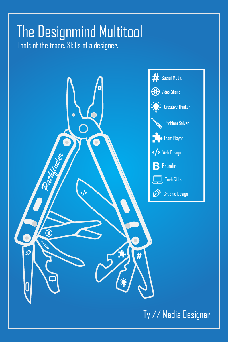
Design Tools Knowledge
Technical Training
Began my high school journey focused on technical and design education.
Joined the Media Pathway. Earned Adobe Illustrator and Photoshop certifications.
Collaborated with a friend to design a logo and a basic product mock-up.
Focused on UI/UX redesigns and expanded my Illustrator skills significantly.
Building this portfolio, preparing for the Premiere Pro certification, and seeking an internship.